
Services — Branding Design
Services — Branding Design

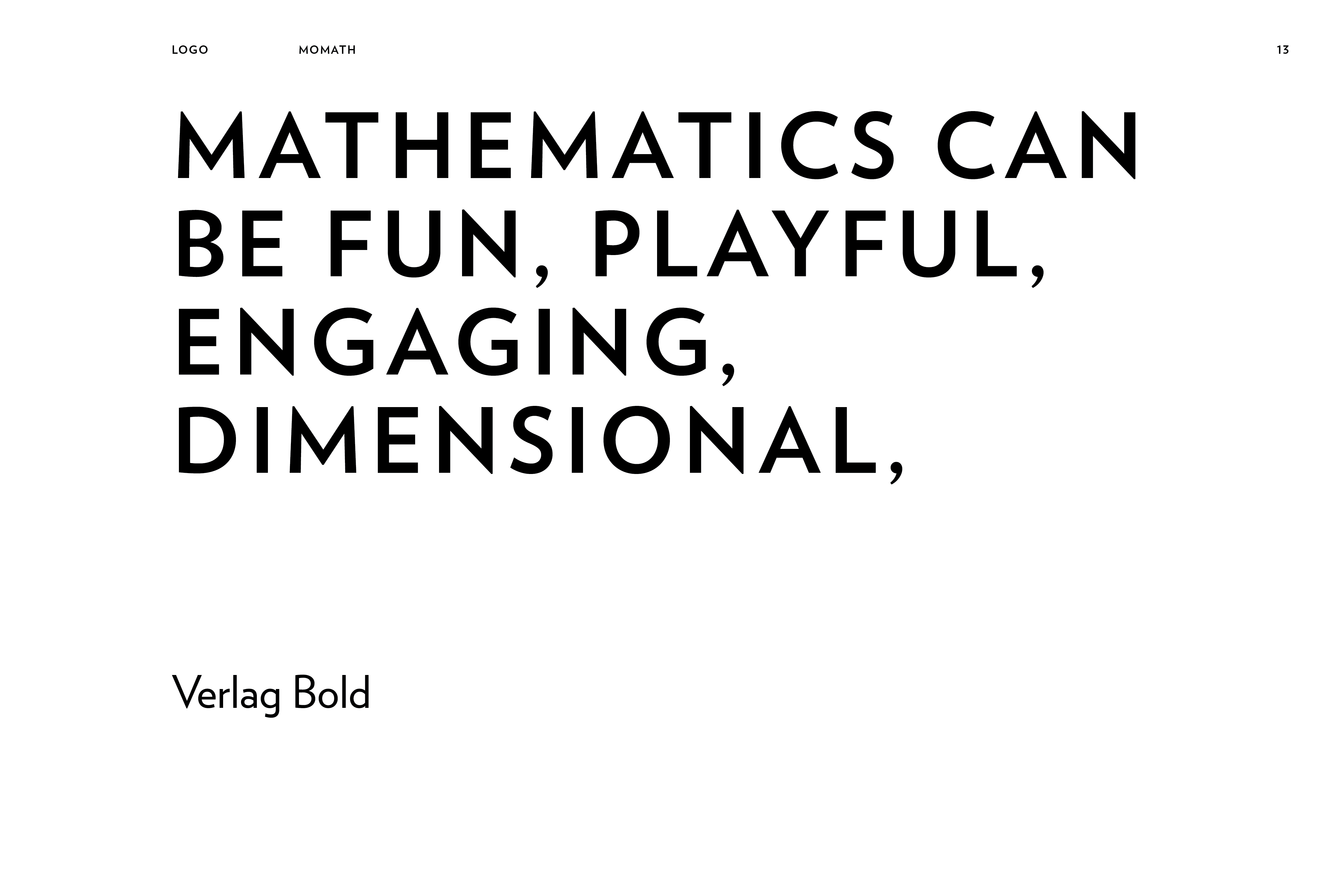
Conceptualize and design a visual identity for MoMath — the National Museum of Mathematics located in New York. The identity should reflect and enhance the playfulness and energy of the museum's hands-on approach, as well as showcase to the audience of all ages, that mathematics can be fun.
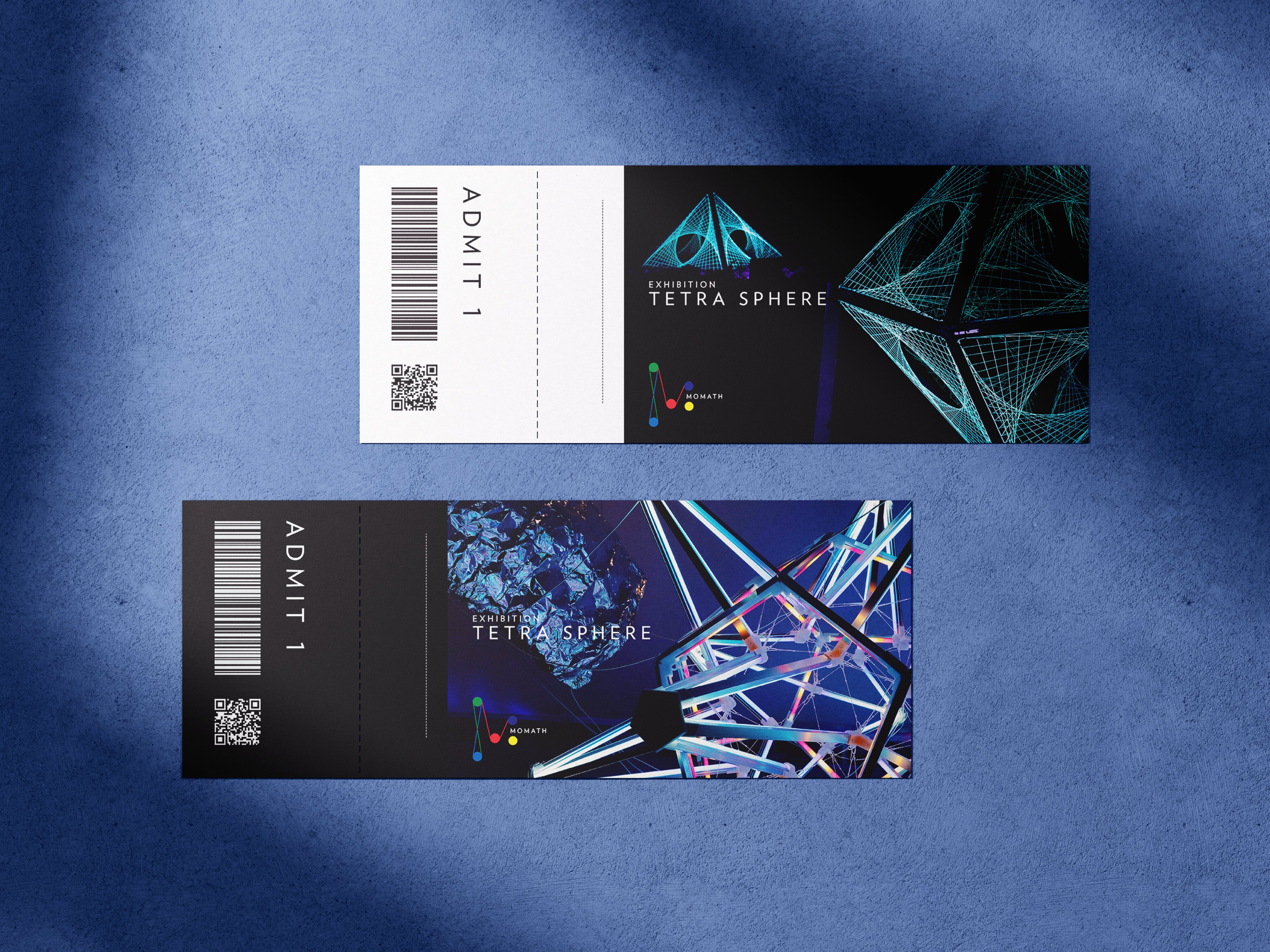
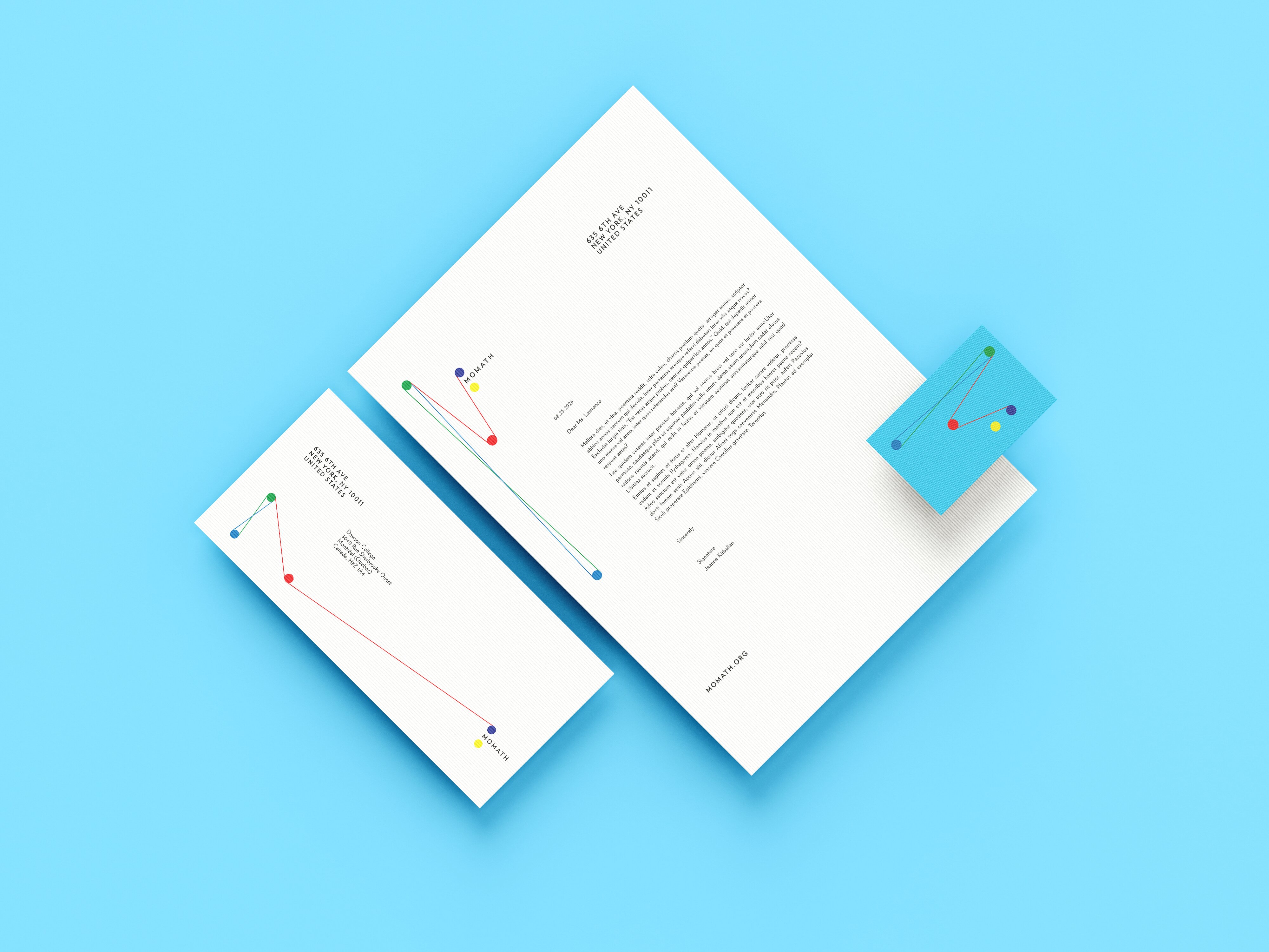
The goal for the new identity of MoMath was to bring more energy and visual vibrancy, to present mathematics as a fun and enganging subject.
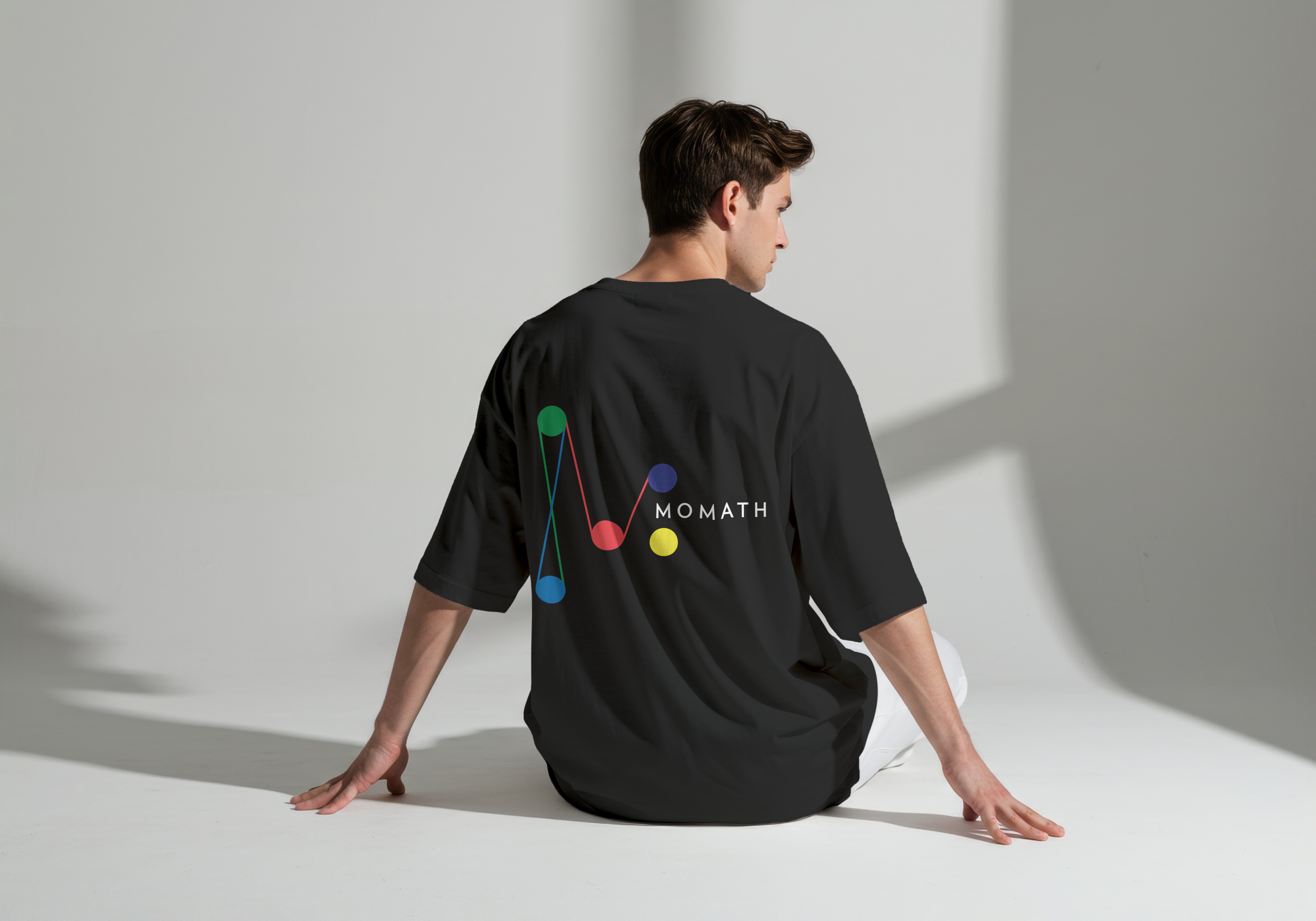
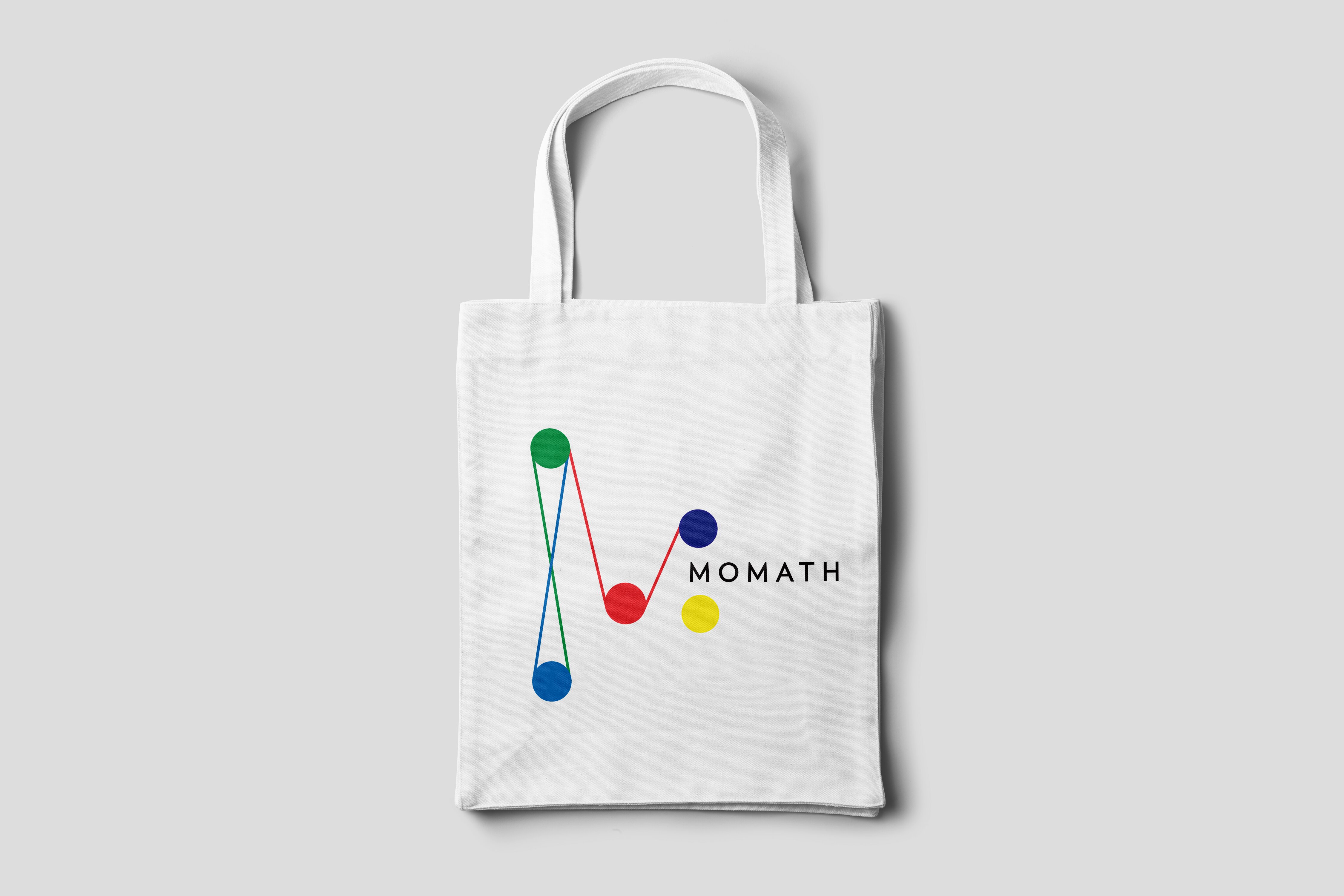
Main idea was to use the capital letter "M", to create further an captivating graphic that would use bright colors that would reflect the playful aspect of museum's hands-on approach. Initial iterations included an "M" consisting fully of mathematical symbols, and a more abstract version made of volume shapes. In the end, a more simple version consisting of lines and dots created the most captivating logotype, that had a lot of opportunities to be explored within various branding applications.
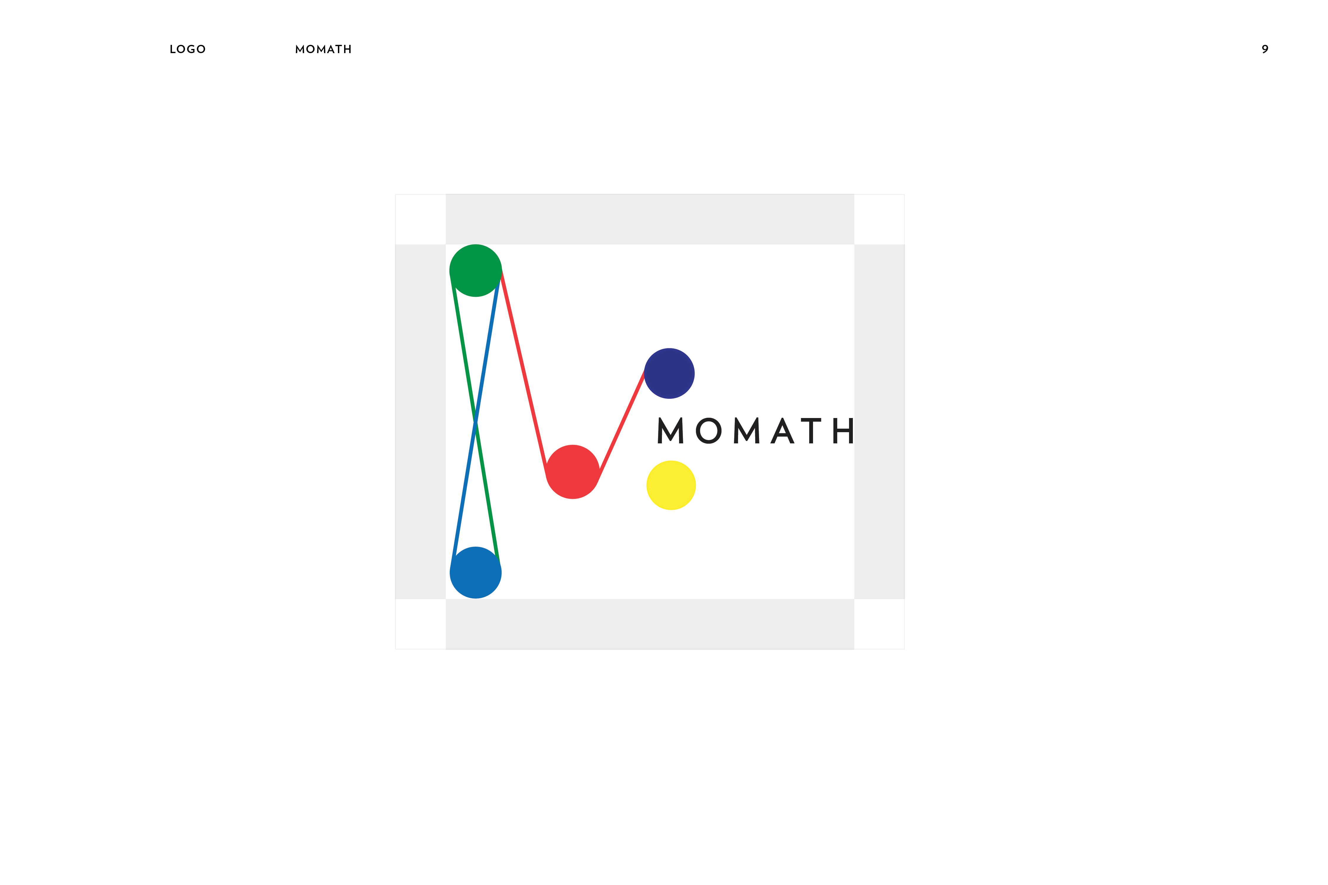
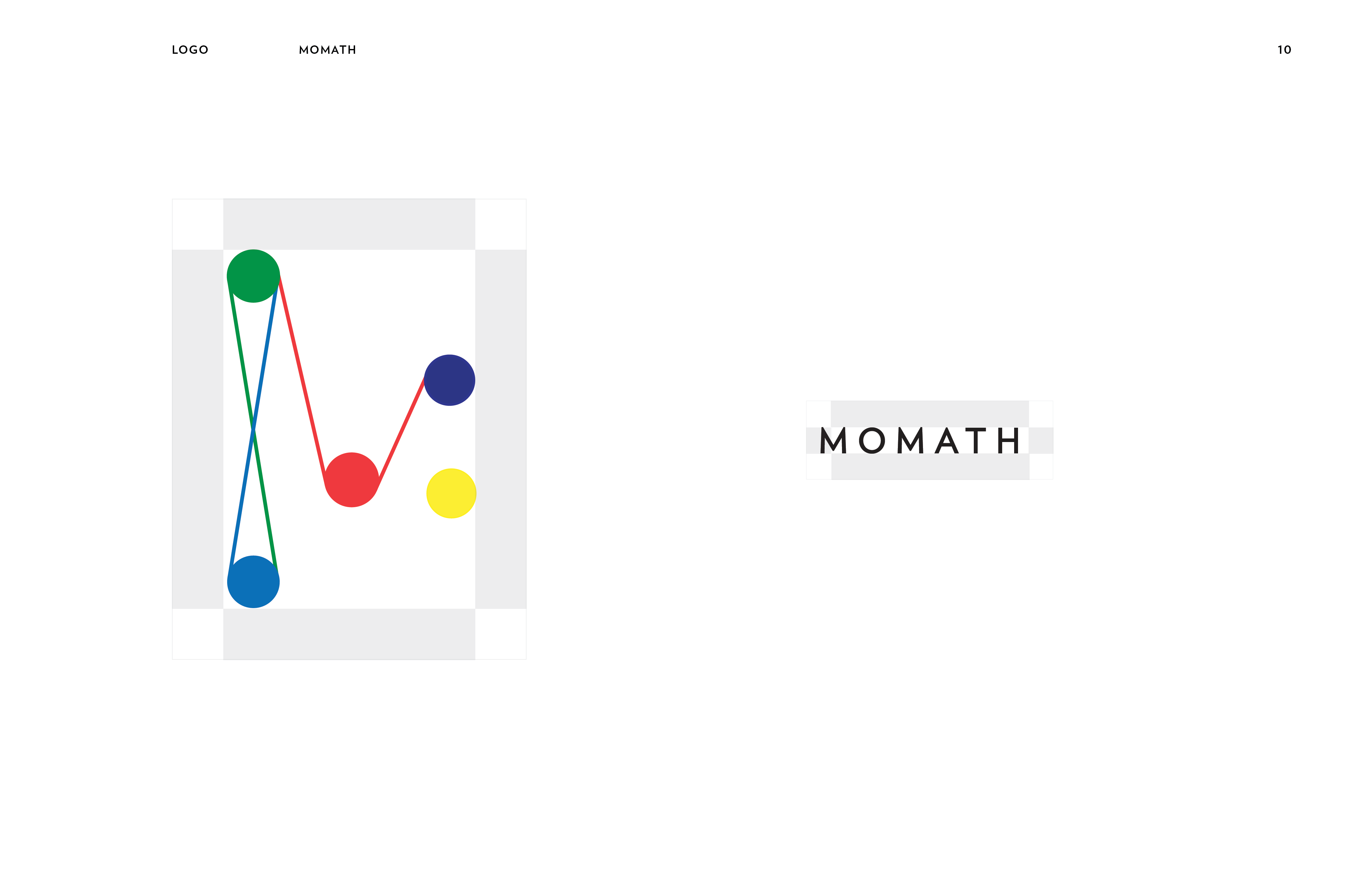
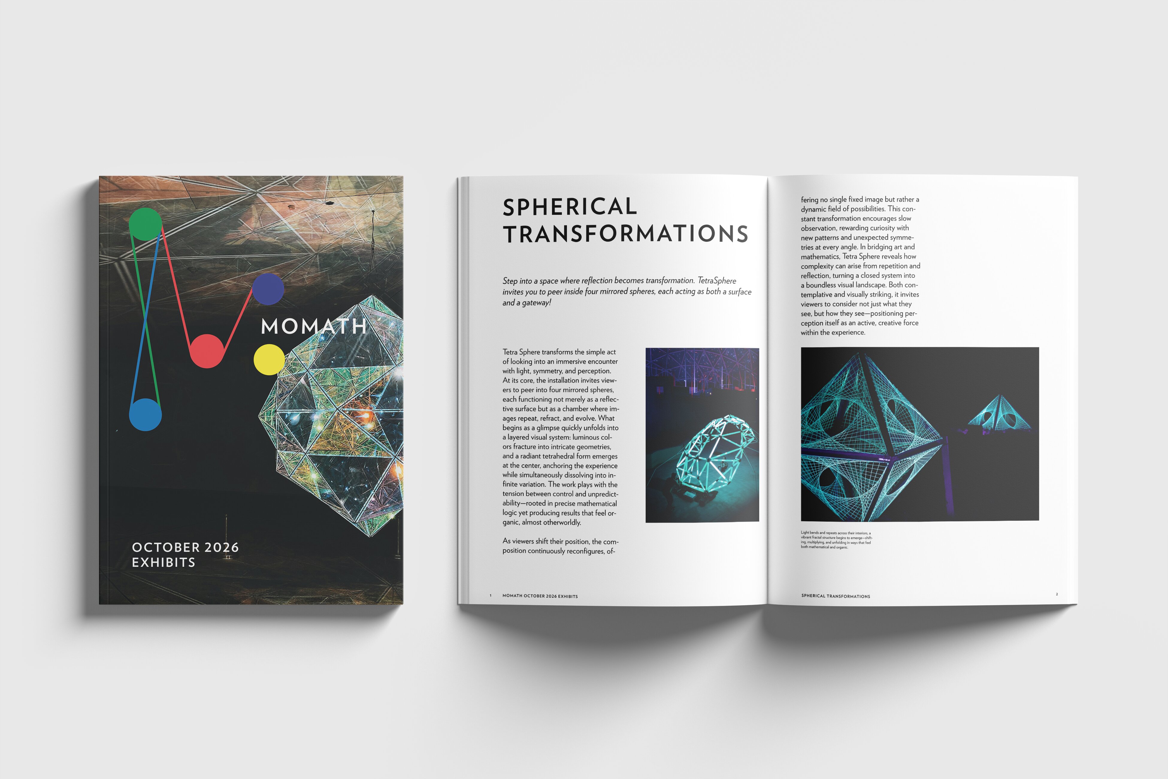
The final logotype presents the letter "M" made of colorful dots connected by thin lines that are are stretching and intersecting. The name of the museum is mindfully incorporated within the logotype, that way effectively presenting the brand. The logotype's shape is very flexible and colorful, that signifies the playfulness and energy MoMath aims to show their audience about mathematics. It also gave the opportunity to explore its shape in various forms in some of the brand's applications like the stationery kit.


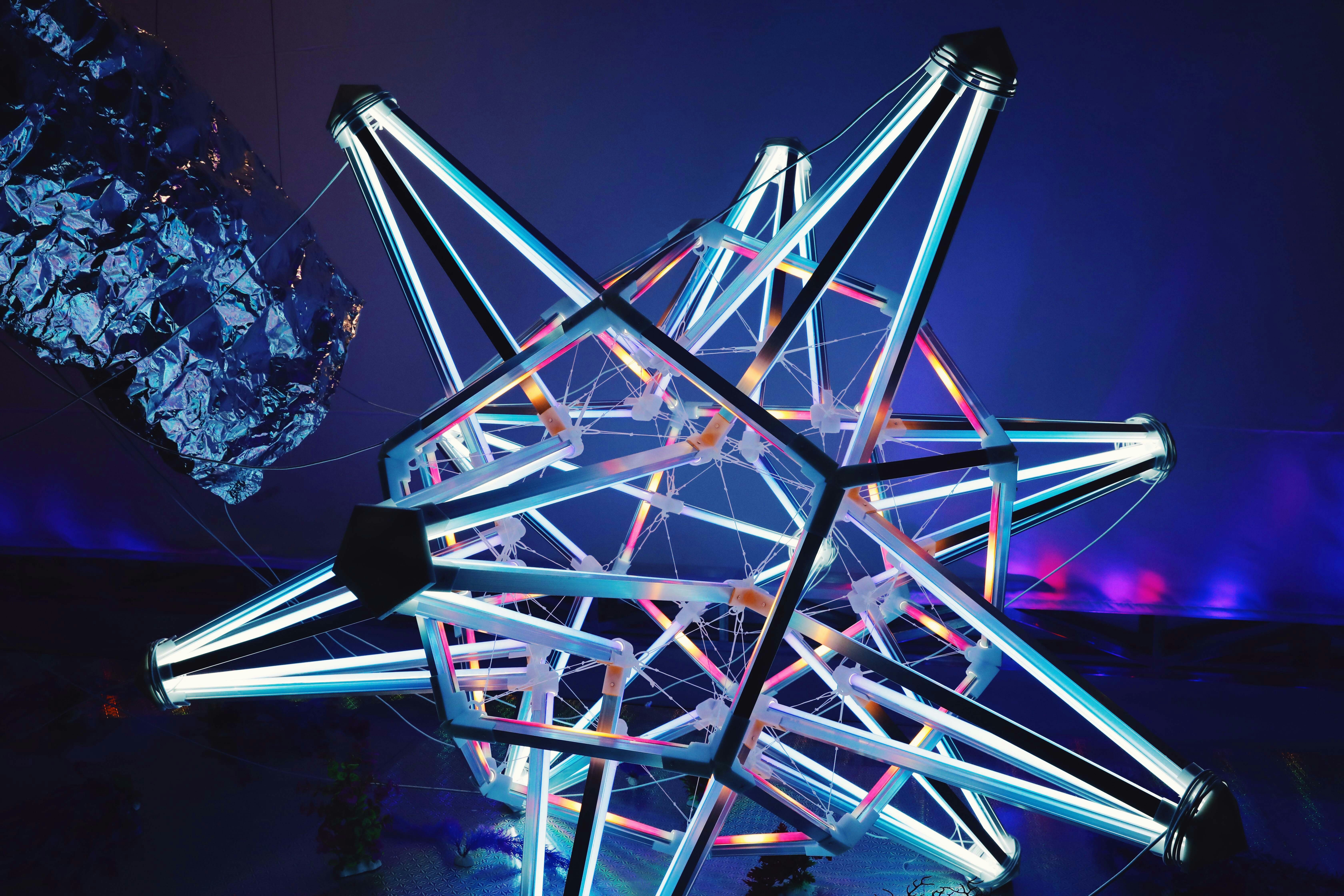

Haunting Dessert Recipes — Cookbook
Editorial Design
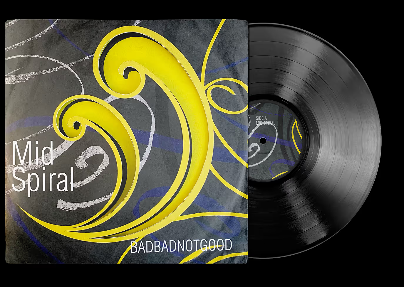
Mid Spiral 7’’ Vinyl — Record Sleeve
Packaging Design
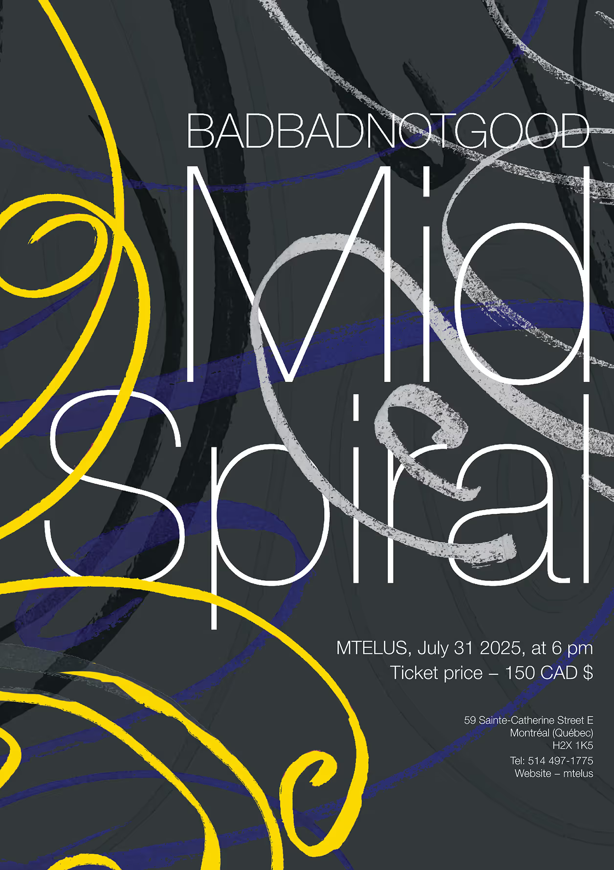
Mid Spiral — Music Poster
Promotional Design
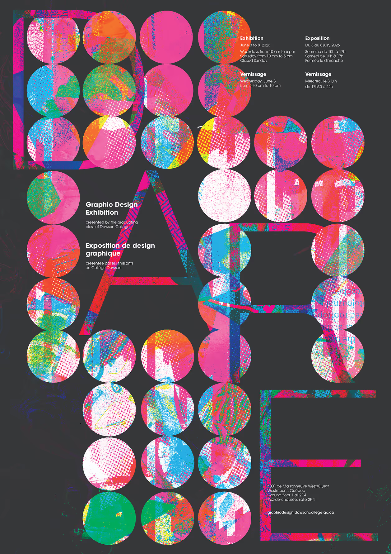
DARE — Dawson Exhibition Poster
Promotional Design

Domaine de Lavoie — Wine Labels
Packaging Design